Matplotlib과 Seaborn은 Python 내의 라이브러리 중 하나로, 데이터의 시각화에 주로 활용 된다.
Matplotlib을 위주로 작성을 해보겠다.
Matplotlib 예시 코드들
기본
import matplotlib.pyplot as plt

x = [1,2,3,4,5]
y = [2,4,6,8,10]

plt.plot(x,y)
plt.xlabel("x-axis")
plt.ylabel("y-axis")
plt.title("Example")
plt.show()
도구들
import pandas as pd

df = pd.DataFrame({
    "A": [1,2,3,4,5] ,
    "B": [5,4,3,2,1]})

df.plot(x = "A", y = "B")
plt.show()
스타일 설정하기
df.plot(x = "A", y = "B", color = "green", linestyle='--', marker="o")
plt.show()

#범례 추가하기
df.plot(x = "A", y = "B", color = "red", linestyle='--', marker="o", \
       label = "data series")
plt.show()

ax = df.plot(x = "A", y = "B", color = "blue", linestyle='--', marker="o")
ax.legend(["data series"])
plt.show()

ax = df.plot(x = "A", y = "B", color = "blue", linestyle='--', marker="o")
ax.legend(["data series"])
ax.set_xlabel("X-axis")
ax.set_ylabel("Y-axis")
ax.set_title("Example")
ax.text(4,3, "some text", fontsize=12)
ax.text(2,2, "some text", fontsize=10)
plt.show()
사이즈 변경하기
plt.figure(figsize=(18,6))
x = [1,2,3,4,5]
y = [1,2,3,4,5]
plt.plot(x, y)
plt.show()

#dataframe과 활용할 때
fig, ax=plt.subplots(figsize=(18,6))
ax = df.plot(x = "A", y = "B", color = "blue", linestyle='--', marker="o", ax=ax)
ax.legend(["data series"])
ax.set_xlabel("X-axis")
ax.set_ylabel("Y-axis")
ax.set_title("Example")
ax.text(4,3, "some text", fontsize=12)
ax.text(2,2, "some text", fontsize=10)
plt.show()
그래프의 종류들
라인 그래프
#line graph

import seaborn as sns

data = sns.load_dataset('flights')
data_grouped = data[['year',"passengers"]].groupby('year').sum().reset_index()
#data를 year를 기준으로 year마다 passengers 를 sum() 하고, 인덱스를 초기화한다.

plt.plot(data_grouped['year'], data_grouped['passengers'])
plt.xlabel("Year")
plt.ylabel("Passengers")
plt.title("YES")
막대 그래프
import pandas as pd

df = pd.DataFrame({
    "City" : ["Seoul", "Daegu", "Busan", "Incheon"] ,
    "Population" : [990, 250, 250, 290]})

plt.bar(df["City"], df["Population"])
plt.xlabel("City")
plt.ylabel("Population")
plt.title("Population per City")
plt.show()
히스토그램
import numpy as np

data = np.random.randn(1000)
data.shape

plt.hist(data, bins=30) #bins가 높아질수록 더 자세히 나온다.
plt.show()
파이 차트
sizes = [30, 20 , 25, 15, 10]
labels = ['a', 'b', 'c', 'd', 'e']

plt.pie(sizes, labels = labels)
plt.show()
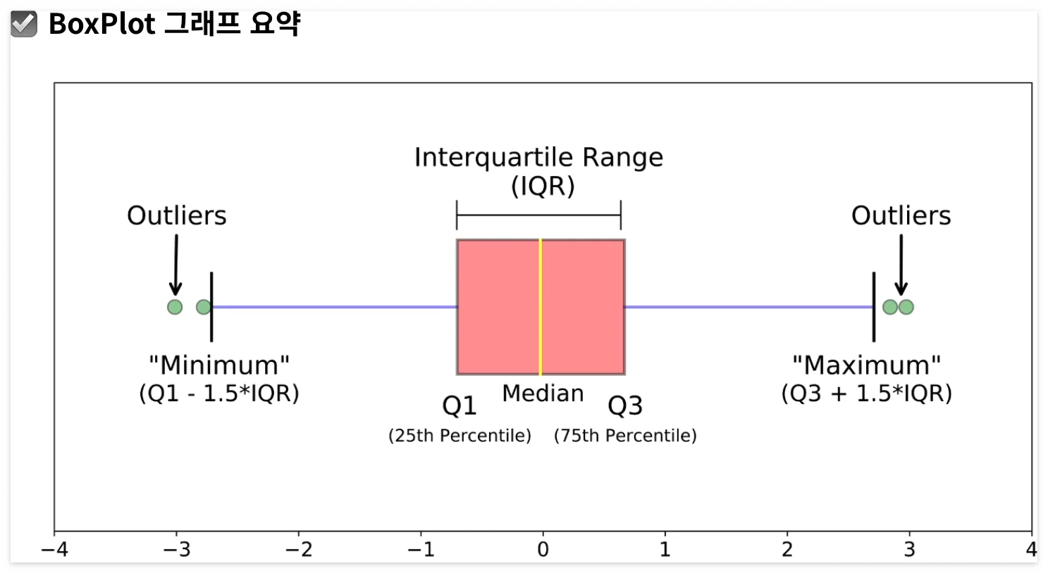
박스 그래프
import seaborn as sns

iris = sns.load_dataset('iris')

sepal_length_list = [iris[iris['species'] == s]['sepal_length'] for s in iris['species'].unique()]
# species 컬럼의 유니크 값들인 s들과 동일한 species 컬럼의 sepal length를 리스트화 함

species = iris['species'].unique()

plt.boxplot(sepal_length_list, labels = species)
plt.show()

sns.boxplot(data=iris, x='species', y='sepal_length') #seaborn을 활용해 그린 그래프
plt.show()
스캐터 차트
import seaborn ans sns

iris = sns.load_dataset('iris')

plt.scatter(iris['petal_length'],iris['petal_width'])
plt.show()
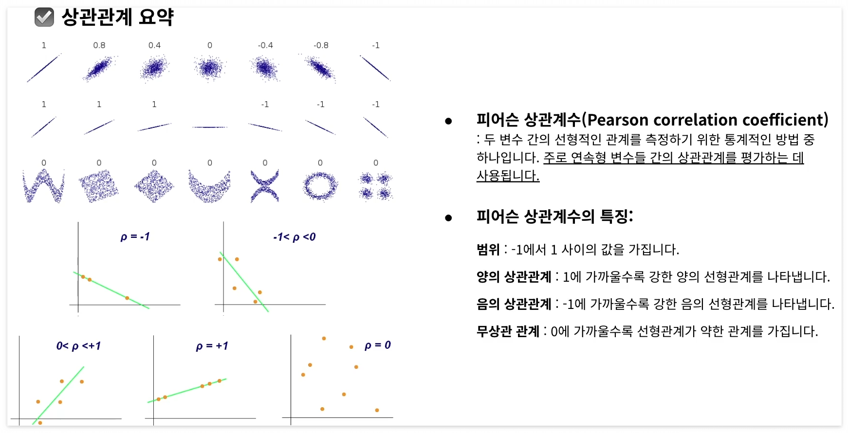
상관계수
iris.corr(numeric_only = True)
# 숫자로 되어있는 자료들만 사용
그래프 요약

BoxPlot 요약
피어슨 상관계수 요약
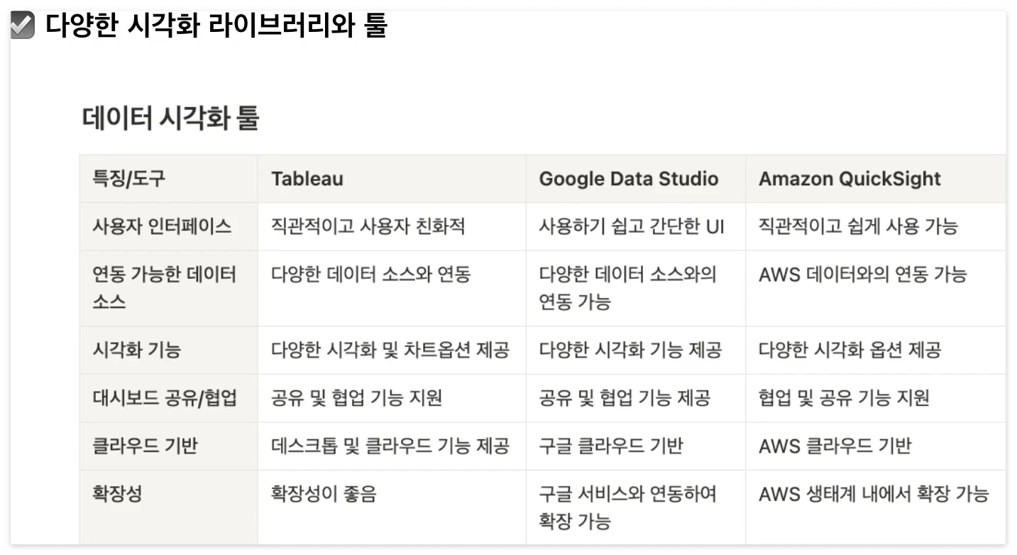
데이터 시각화 툴 요약
'Datalogy' 카테고리의 다른 글
| [데이터 전처리] Python 라이브러리 Pandas (0) | 2024.07.18 |
|---|---|
| [Data Literacy_05] 결론 도출 (0) | 2024.07.04 |
| [Data Literacy_04] 지표 설정과 북극성 지표 (0) | 2024.07.04 |
| [Data Literacy_03] 데이터의 유형 (0) | 2024.07.04 |
| [Data Literacy_02] 문제 정의 (0) | 2024.07.03 |